
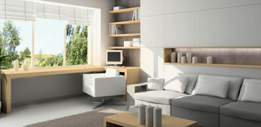
Color is one of the most powerful tools in interior design, yet it is often the most misunderstood. Color is not just a cosmetic choice; it has a profound psychological impact on our emotions, energy levels, and mood. The paint colors and material tones you select for your home define how you experience each room. At Estora Studio, we guide our clients through the process of selecting color palettes that match both their design taste and the functional purpose of each room. In this guide, we explain the science of color psychology and how you can apply it to your home.
1. Restful Tones for Bedrooms and Relaxation Areas
The bedroom is your personal sanctuary, a space designed for rest, recovery, and sleep. Therefore, the color scheme should promote relaxation. Estora Studio designers recommend cool, low-saturation tones like soft blues, sage greens, and warm lavenders. Blue has been scientifically proven to lower heart rate and reduce blood pressure, making it the ideal bedroom choice. We suggest avoiding high-energy colors like bright red or orange in sleeping areas, as they stimulate the mind and can disrupt sleep. Warm neutrals like beige, taupe, and off-white are also excellent choices for creating a cozy atmosphere.
2. High-Energy Colors for Creative and Social Spaces
For areas of the home designed for high activity, social gathering, and creativity—such as the kitchen, dining room, and home office—we select warmer, more stimulating colors. Yellow evokes feelings of happiness and triggers creativity, making it a great accent choice for home offices or creative studios. Orange and warm reds are known to stimulate appetite and conversation, which is why they are often used in dining rooms and kitchens. However, because these colors are intense, Estora Studio recommends using them as accents on single walls or through accessories, keeping the main background neutral to avoid sensory overload.
3. Implementing the 60-30-10 Design Rule
To achieve a balanced and harmonious color scheme, our design teams use the classic 60-30-10 rule. This rule dictates that 60% of the room should consist of the dominant color (usually a neutral paint color on walls), 30% should be the secondary color (wood tones, upholstery, or curtains), and 10% should be the accent color (cushions, artwork, or table lamps). At Estora Studio, we use this ratio to ensure that even bold colors like emerald green or navy blue can be integrated into your home without overwhelming the layout, creating a balanced and visually cohesive interior.
4. Understanding Paint Sheens and Light Reflection
The color you see on a swatch can look completely different on your walls, depending on the paint sheen and lighting. Matte or flat finishes absorb light and hide surface imperfections, making them perfect for low-traffic areas like ceilings and bedrooms. Satin and semi-gloss finishes reflect light, making colors look brighter and surfaces easier to clean, which is ideal for kitchens and corridors. Estora Studio recommends painting large sample patches on different walls in the room to observe how the color shifts under both morning daylight and warm evening LED lighting before committing to a final paint decision.